- Digital Marking System for CBSE
- +91 9229113533
- +91 9229113566
- info@addmengroup.com
- Send Query
- Available as OEM on GeM
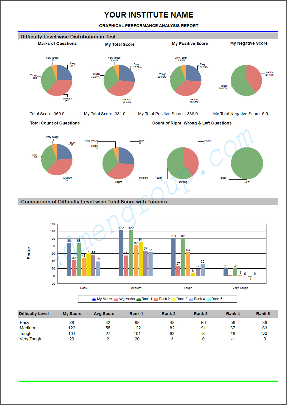
Every question paper has a mix of questions of different difficulty levels. In almost all cases, the test report shows the total marks received by the students and does not focus on the difficulty level of the questions. However, the Addmen OMR software can generate detailed graphical reports as per the difficulty level of the questions.
The graphical performance analysis report provided above provides the distribution of total marks of the tests in a pie diagram format.
This is followed by the scores received by the student as per the difficulty level of the questions. The marks are represented in the form of percentage.
Next to this comes the pie diagram with the positive scores received by the students as per the difficulty level of the questions. The negative scores are also distributed in the form of a pie diagram according to level of difficulty.
The next section begins again with a pie chart that has number of questions in each difficulty level. The difficulty levels include easy, medium, tough and very tough.
This is followed by three pie diagrams that represent the count of right, wrong and left questions of the student.
The next section consists of a bar diagram that compares the difficulty-wise scores of the students with that of average marks and top five marks. The same is represented in a tabular format too.
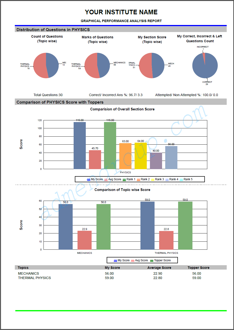
The three graphical performance analysis reports provided below distribute the test papers of each subject as per the difficulty level of the questions.
The test reports are of three subjects, namely Physics, Chemistry and Maths. The format of all the three reports is the same.
The first section has eight pie diagrams. The questions are divided into four levels: easy, medium, tough and very tough.
The first has difficulty level of questions as per marks allotted to each level.
The second one shows how many marks the student received in each group (percentage-wise).
The third pie chart shows the positive scores of the student in the four levels and the fourth one shows negative score in all the difficult levels.
The next pie chart distributes the questions according to the number of questions in every level. The next three diagrams show the count of right, wrong and left questions.
In the first (Physics) and last reports (Maths), there are only seven pie diagrams as the student does not leave any question unanswered in any level.
The pie charts are followed by bar graphs where the student's scores in each section are compared with the total score, average score and topper score. These scores are also presented in tabular format.


| Download Full Graphical Performance Report PDF |
About OMR Sheets
OMR Design & Print
OMR Sheet Scanning
OMR Reading & Checking
Result & Output